
BNP Paribas: Agriemission – a CO2 emission calculator designed to facilitate the green transformation
Meet Agronomist
Agronomist, established by BNP Paribas, a renowned international leader in providing financial services for the agricultural and farming sector, is a platform with a strong ambition and a very clear vision to drive the green transition of the farming sector.
With a strong focus on delivering cutting-edge analytical tools for farmers, Agronomist is determined to lead the charge towards a sustainable future by offering a diverse range of analytical tools designed to empower farmers on many levels.
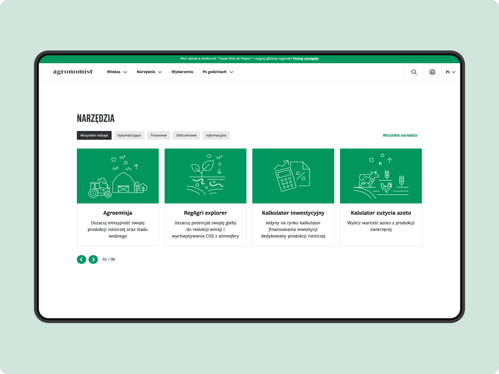
Platform’s comprehensive toolbox includes a wide range of calculators of emissions from both plant and animal farming, a comprehensive suite of financial tools, farm management tools, and specialized resources.
These handy assets are specifically curated to assist farmers in effortlessly transitioning towards sustainable farming practices, guaranteeing a comprehensive approach to financial prosperity and agricultural sustainability.
The challenge
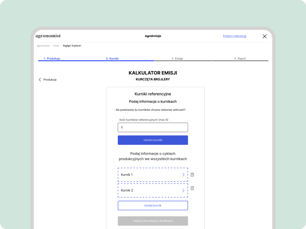
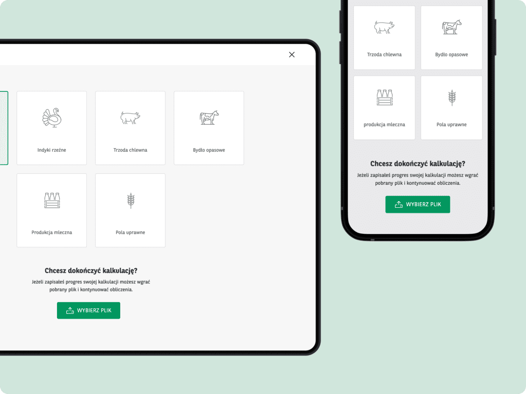
For Agronomist we embarked on an exciting quest to design a smart UX and highly sophisticated and deeply analytical tool—Agriemission, a CO2 emissions calculator— that would allow to calculate emissions for four distinct models of livestock farming: chickens, turkeys, pigs, and cows.
This calculator was developed based on an extensive domain-specific documentation delivered by KPMG, one of the world’s leading professional services firms offering audit, tax, and advisory services.
This dossier was a comprehensive guide and covered topics such as farming practices, livestock management, environmental impact, and emission measurements.
A significant challenge was to maintain the calculator’s core mechanics while accommodating the diverse models of farming methods associated with these four types livestock
Simultaneously, to designing a smart, consistent and intuitive User Experience we needed to create a seamless UI that would expertly guide users through the intricacies and complexities of this powerful tool.
Scope & services
Our in-house tam of designers and developers provided an extensive range of services.
In addition to our usuall UX and UI design scope, we devoted a substantial amount of time to conducting in-depth analysis of domain-specific documentation.
This meticulous examination of relevant resources allowed us to gain comprehensive insights and expertise in the domain, ensuring that our solutions were informed, accurate, and tailored to meet the unique needs of the project. Our scope included:
- Client workshops
- Scoping Sessions
- Benchmarking
- Product Design
- Development
The result
We successfully tackled the challenge of distilling a highly complex domain-specific document into a user-friendly and linear form that expertly guides users through the modeling of their livestock production.
Each farming model presented unique variations but we managed to identify parallel characteristics across all four models.
The aim was to ensure consistency and ease of use, providing users with a seamless experience regardless of the specific livestock keeping model they are working with.
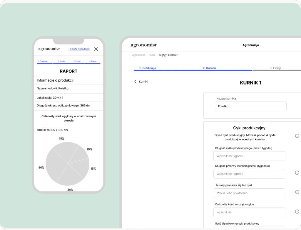
The calculation process maintains a strict linear flow, whether accessed on the desktop or mobile version. To eliminate distractions, any unnecessary elements are removed, allowing users to focus 100% on filling in the form.
Once the user completes the form, they are presented with a comprehensive report that provides them with valuable insights into the environmental impact of their livestock operations and puts them on the the path of more sustainable manufacturing.
Check Agriemission calculator (registered users only)
How we did this
Client’s active involvement and expertise proved to be invaluable in shaping the analytical aspects of the solution, their input and insights guided our approach and ensured the accuracy and relevance of the design.
By combining the client’s insights with our expertise in UX and UI design, we were able to create a solution that effectively addressed the analytical needs while providing a user-friendly and visually appealing experience.
Discovery phase
To ensure alignment between our ideas and project vision, we initiated a productive scoping session in close collaboration with domain experts and dedicating numerous hours on analysing wast documentation provided by the client.
Workshop sessions served as a crucial foundation for our design team’s, guiding design decisions on the most effective solutions.
Additionally, due to highly analytical nature of the project we’ve spent countless hours on opened discussions and sessions between both design and development teams to ensure our ideas and concepts will fulfill the core functionalities of the calculator.
Key insights
- Focus on usability and ease of use
- Provide users with clear explanations and instructions written in plain language
- Construct a clear and organized report that will allow users to grasp the key information quickly
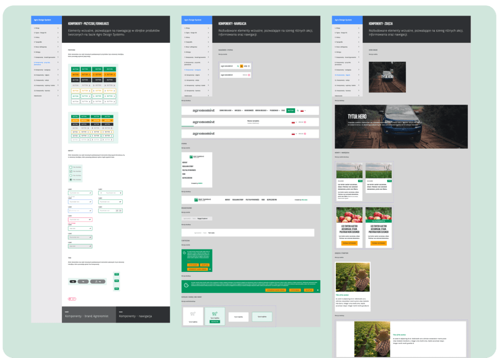
- Create a cohesive visual and functional perception of a all calculators
- Ensuring consistency with Agronomist platform is a crucial aspect
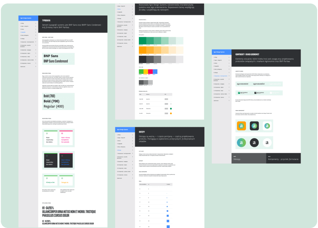
- We adhered to an existing Agronomist design system
Design, creation & development phase
Throughout the design and developing process we followed elements of lean frameworks such as:
- Workshop sessions
- Elements of Jobs To Be Done
- Getting things done
- P2P development
UX design
During the development of the calculator, our design team followed a meticulous UX process and engaged in ongoing workshops and consultations with experts, and developers, to gather valuable insights and align our design approach.
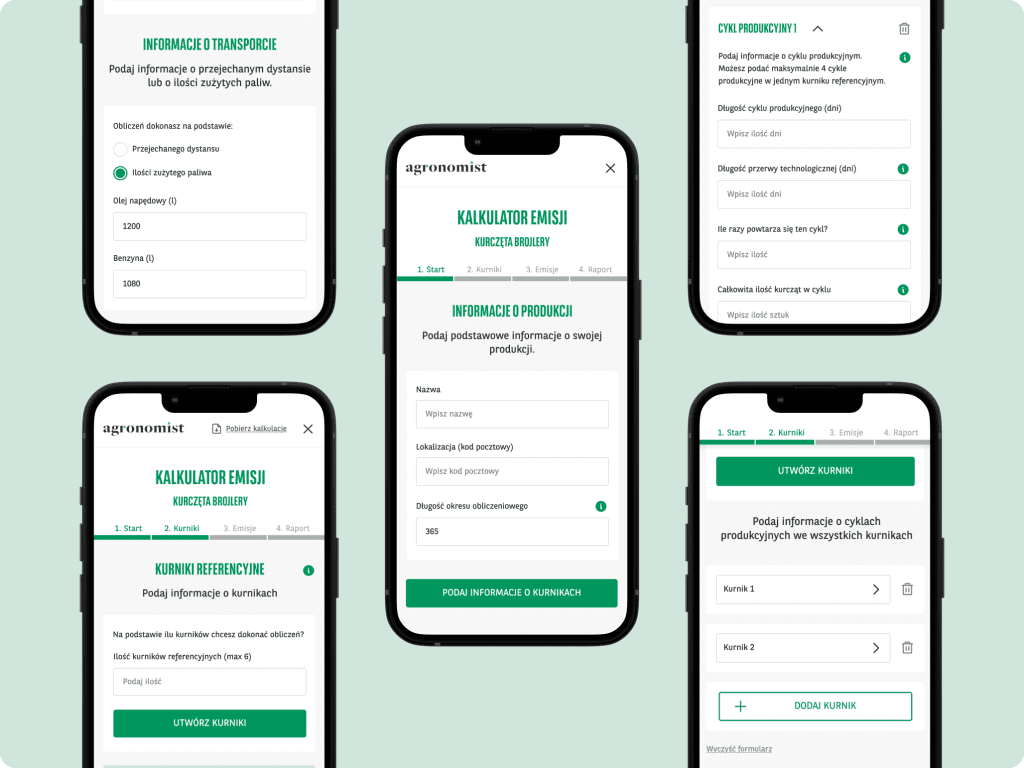
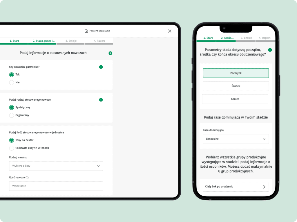
To visualize our ideas and gather feedback, in an iterative process, we delivered a set of low-fidelity mockups for both desktop and mobile.
These mockups served as tangible representations of our design concepts, capturing the core functionalities and layout of the calculator.
Following elements of the “getting things done” methodology, we tackled one livestock model at a time, with each iteration involving insights from our experts and feedback from our development team, allowing us to enhance the usability of the tool.
As a result, we delivered detailed low-fidelity mockups of all four calculators for both desktop and mobile platforms.
UI design
UI design played an equally important role alongside UX design, as they both complemented each other in creating a cohesive and user-friendly experience.
To ensure consistency and familiarity, we based our UI design on the Agronomist’s Design System. Building on well-established design patterns, color schemes, typography, and other visual elements, helped us maintain seamless integration with the client’s broader ecosystem.
This approach not only enhanced the usability of the tool but also provided users with a sense of familiarity and confidence while interacting with the interface.
Agriemission – a powerfull greenhouse gasses emission calculator
Ecosystem of tools
While farming practices can vary, our primary focus was to establish common ground and implement consistent UX and UI logic across all calculators.
This harmonized approach allowed us to deliver a unified toolset that accommodates to the specific nuances of each animal farming process.
By ensuring a consistent experience across different farming models, users are not occupied with learning new mechanics each time and they can put their sense of familiarity of the tool into action and seamlessly apply it to multiple farming models. This approach streamlines their workflow, saves time, and enhances overall user efficiency.
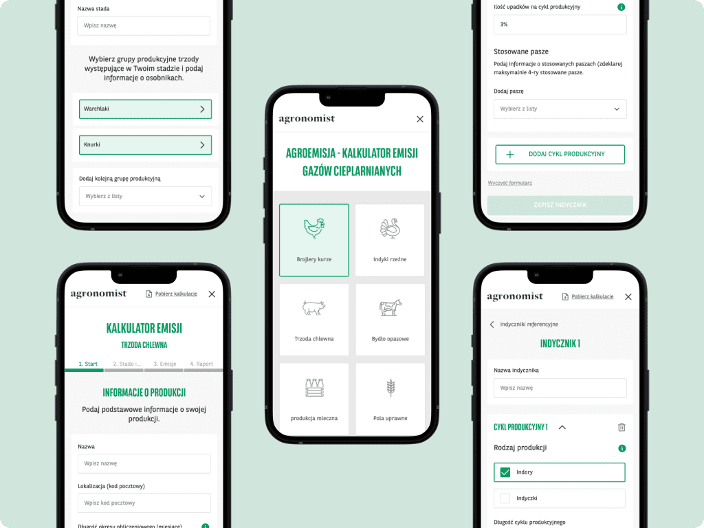
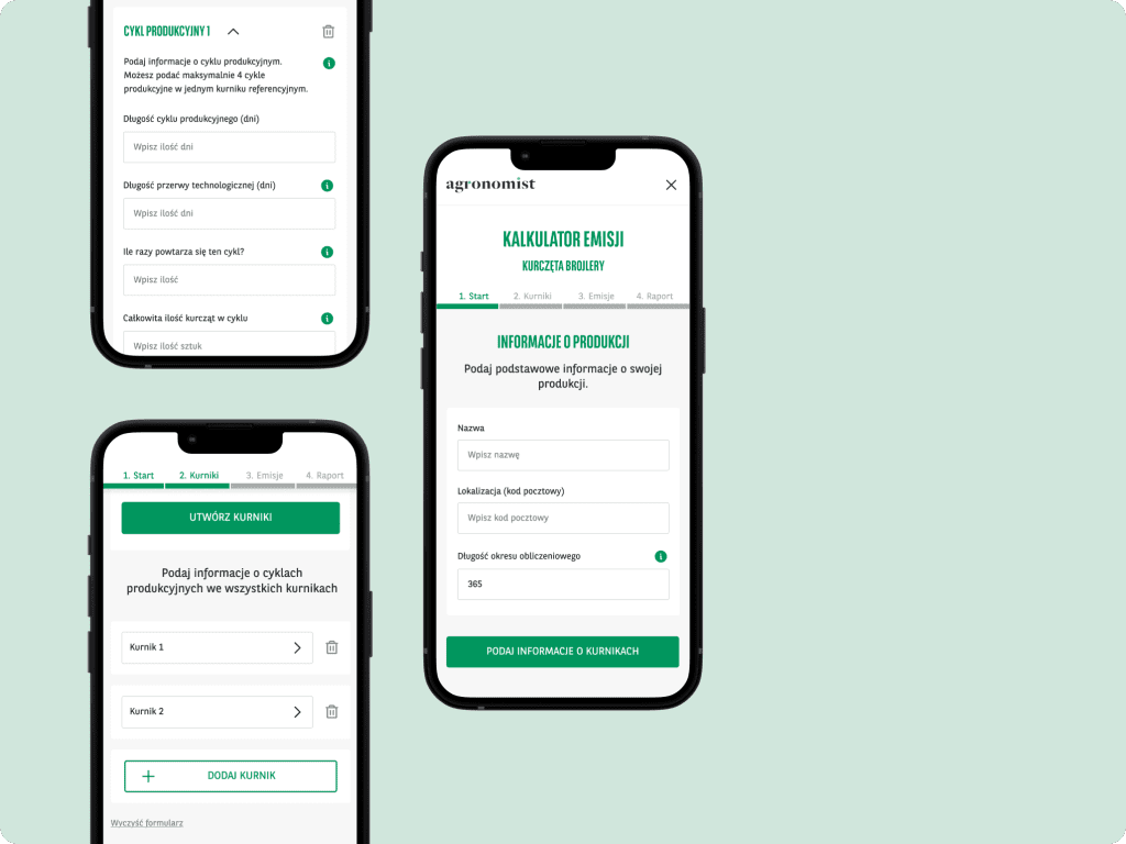
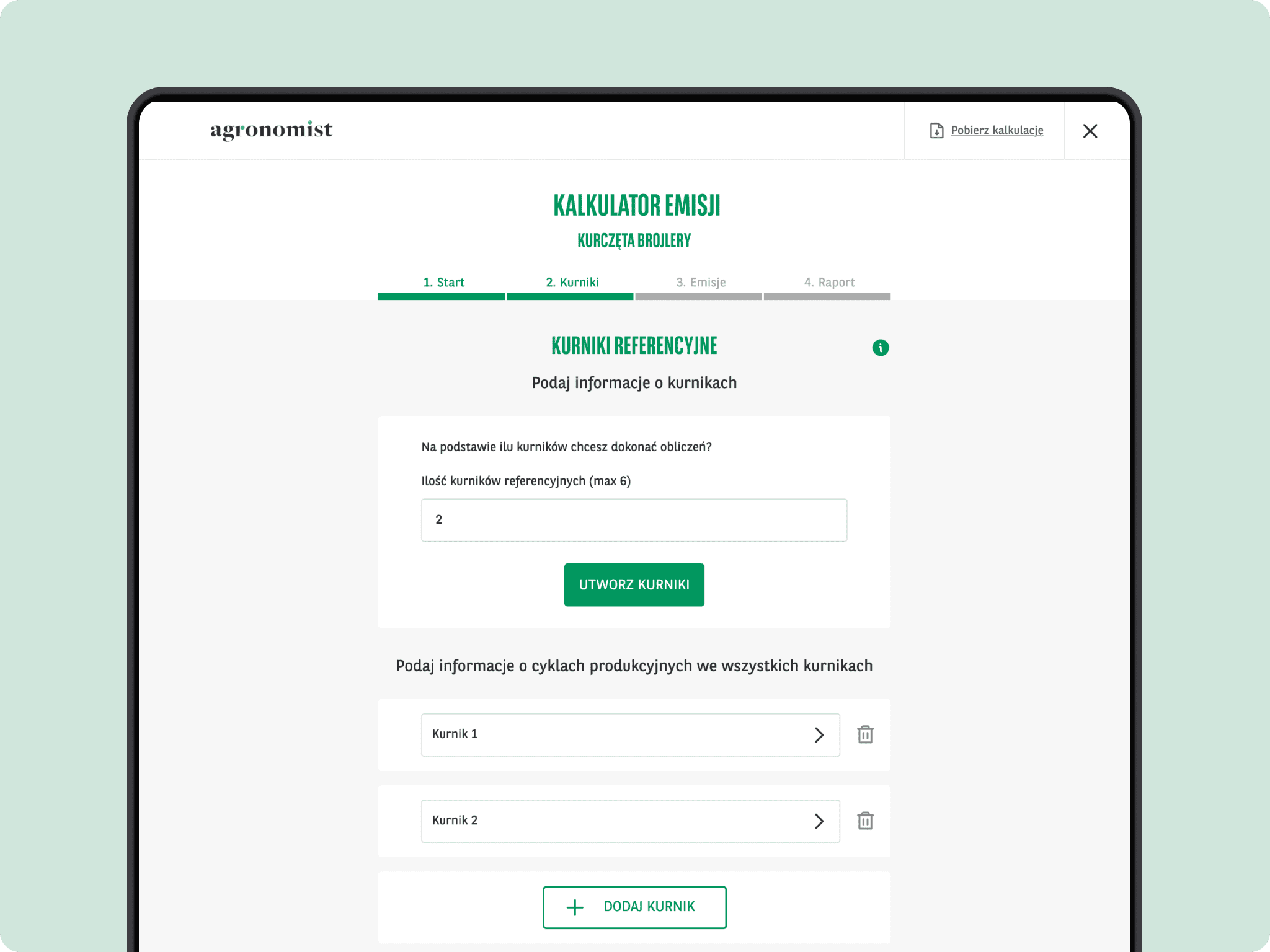
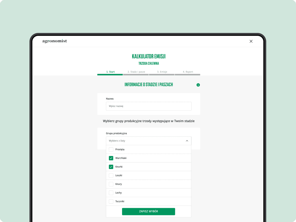
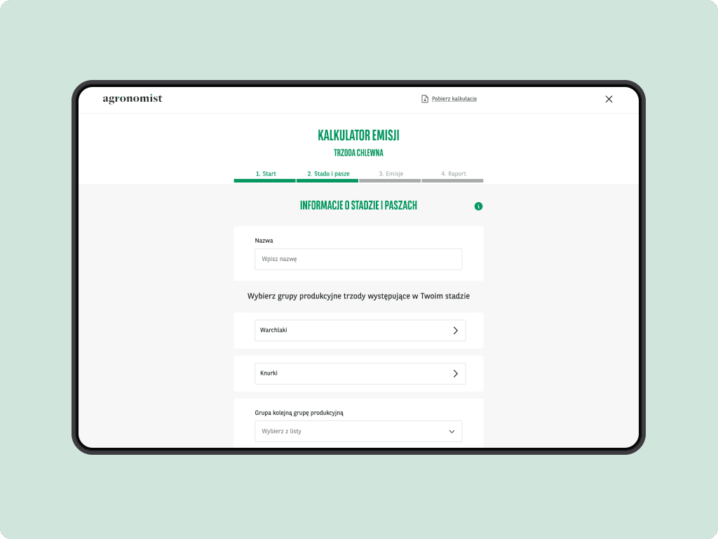
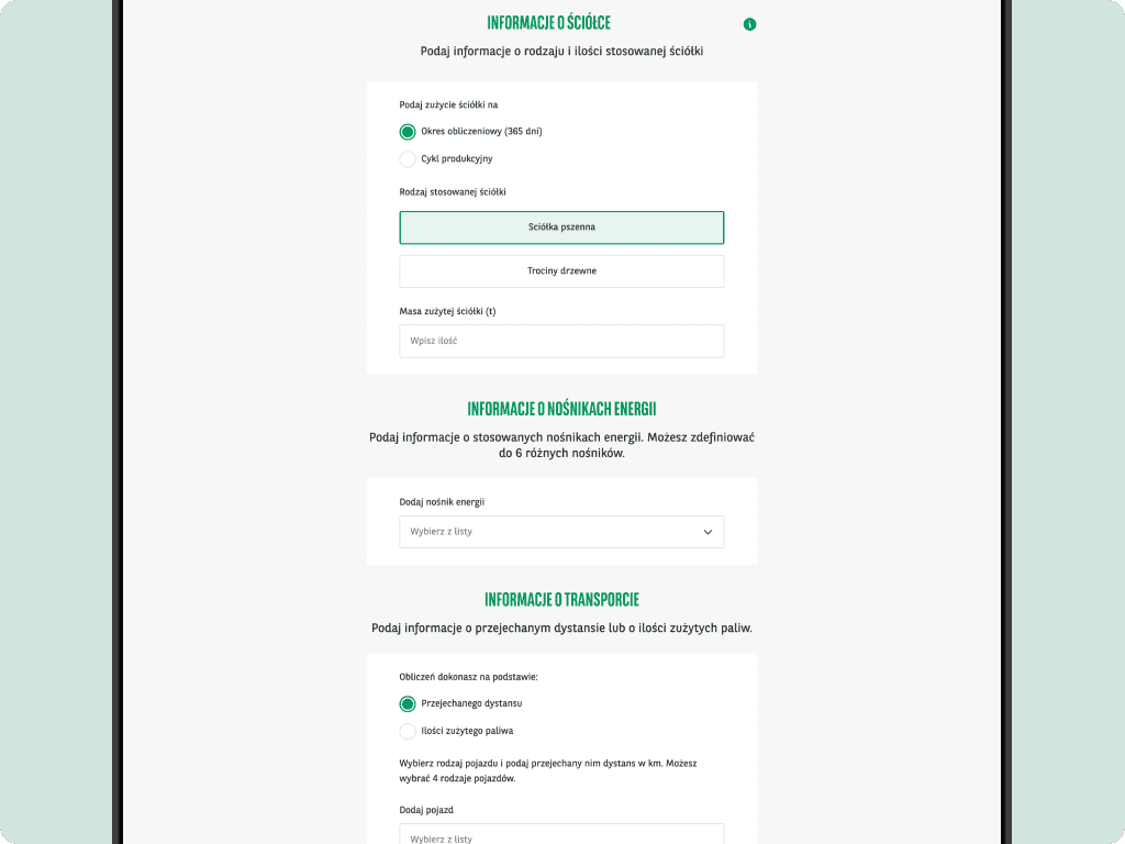
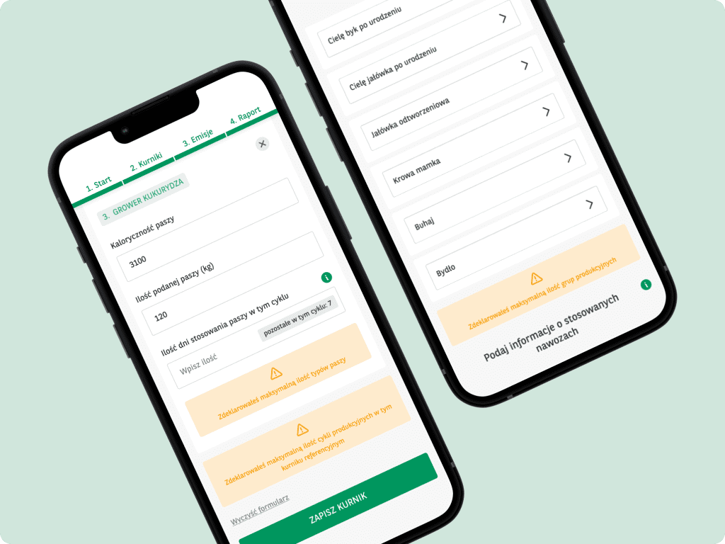
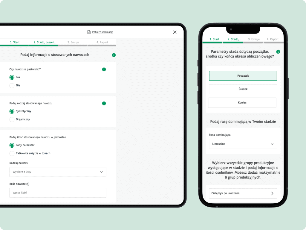
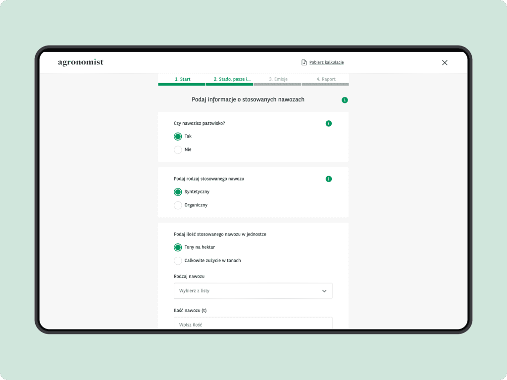
Linear form with zero distractions
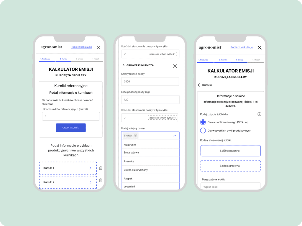
Being completely aware of the complexity of the tool, we decided to visually divide the form down into smaller, manageable chunks which they can take one baby step at a time.
By breaking down the form into sections, users can proceed through the process gradually, ensuring a smooth and hassle-free experience.
Guided journey
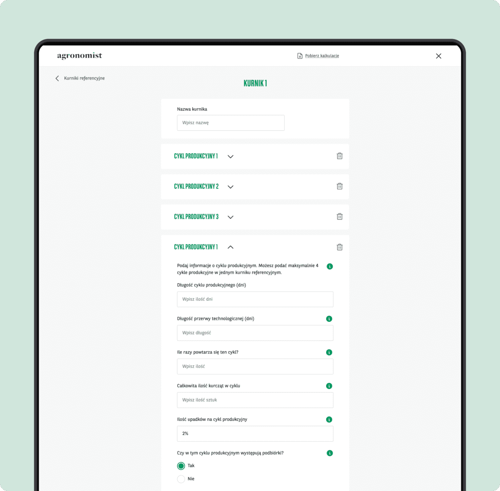
We expertly guide users through the intricate process of modeling their livestock productions providing concise explanations and instructions that help them to understand and complete each field or section.
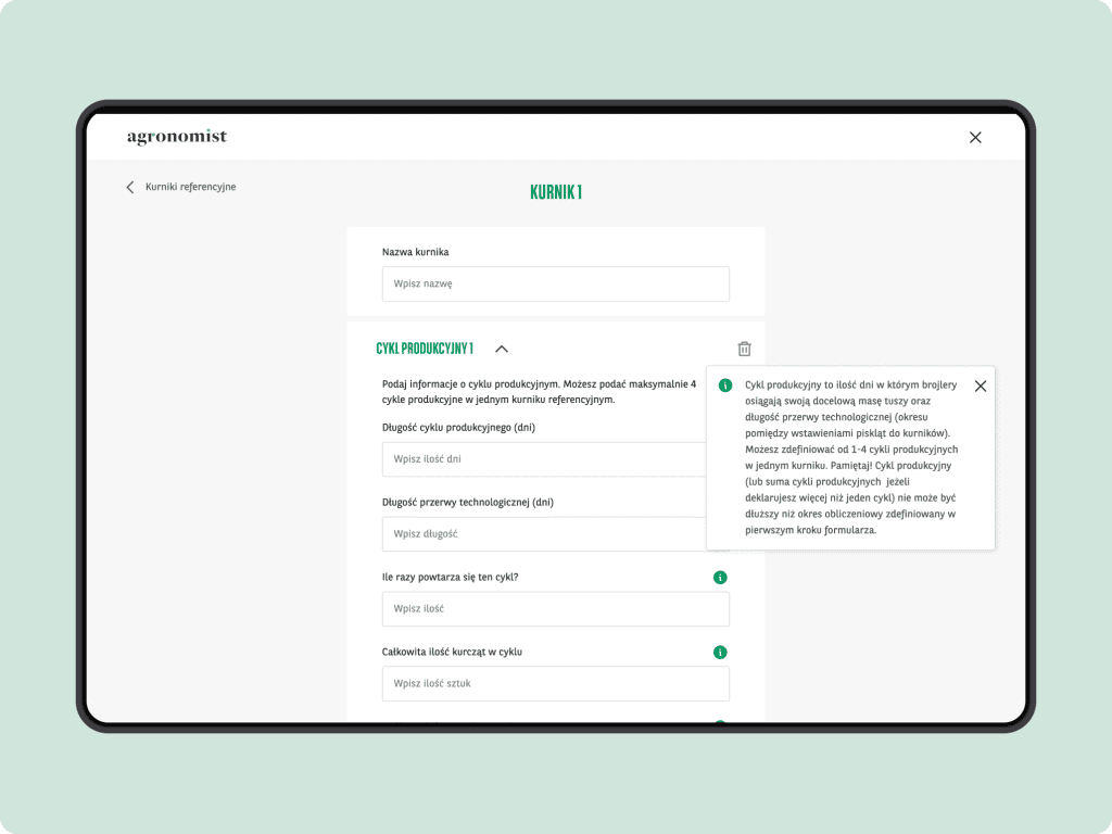
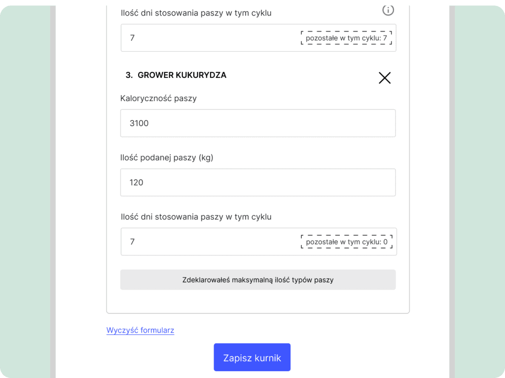
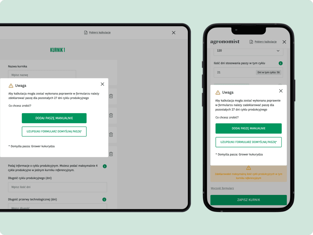
During particularly critical moments when users may be vulnerable to errors that could jeopardize the final calculation, we come to the rescue with a super handy feature: days countdown.
This convenient tool assists users in keeping track of the remaining days within the production cycle for which they need to provide information. This seemingly small yet powerful feature promotes controlled input, ensuring the users will provide all necessary data to finish calculation and generate report.
By using plain language in tooltips we ensure that the communication used is clear, concise, and easily understandable for all users, regardless of their level of familiarity with farming jargon.
We like to think that these handy set of tooltips, modal windows, and other helpful features with clear explanations act as road signs, helping users navigate the form with confidence and minimizing any potential confusion or errors.
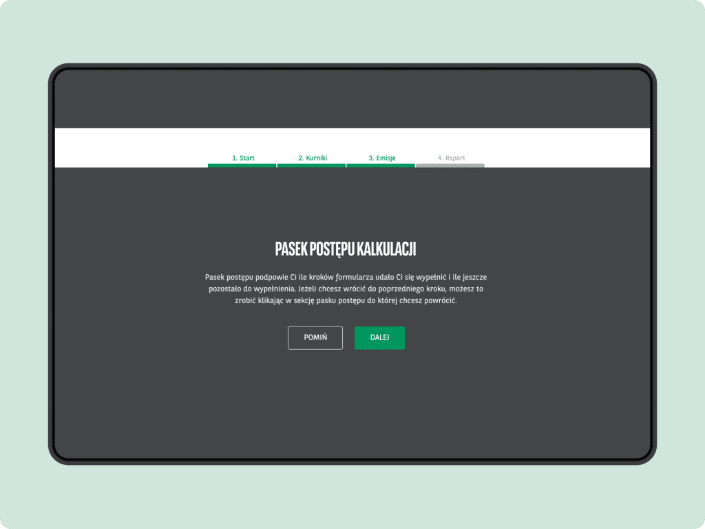
Controlled progress
The progress bar is a crucial element of every form or questionnaire. By visually indicating the progress made, it offers users a clear sense of how much of the workload they have completed and how much remains.
Progress bar becomes even more important in lengthy and complex forms, where users may need to invest a significant amount of time and effort. It helps users understand the overall structure of the form and breaks down the process into manageable chunks. This promotes a feeling of efficiency and prevents users from feeling overwhelmed.
On top of all the above, the progress bar allows users to easily navigate back and forth between different sections of the form, enabling them to review or edit their inputs.
This small feature but powerful enables users to track their progress easily resulting in greater control over the whole journey.
Saving progress
Non enough time or data to finish the calculation? No problem!
Users can download their calculation progress and upload it back into the calculator whenever they are ready to resume their work.
This convenient functionality allows users to maintain continuity in their calculations, so they can dive back into their calculations at their convenience.
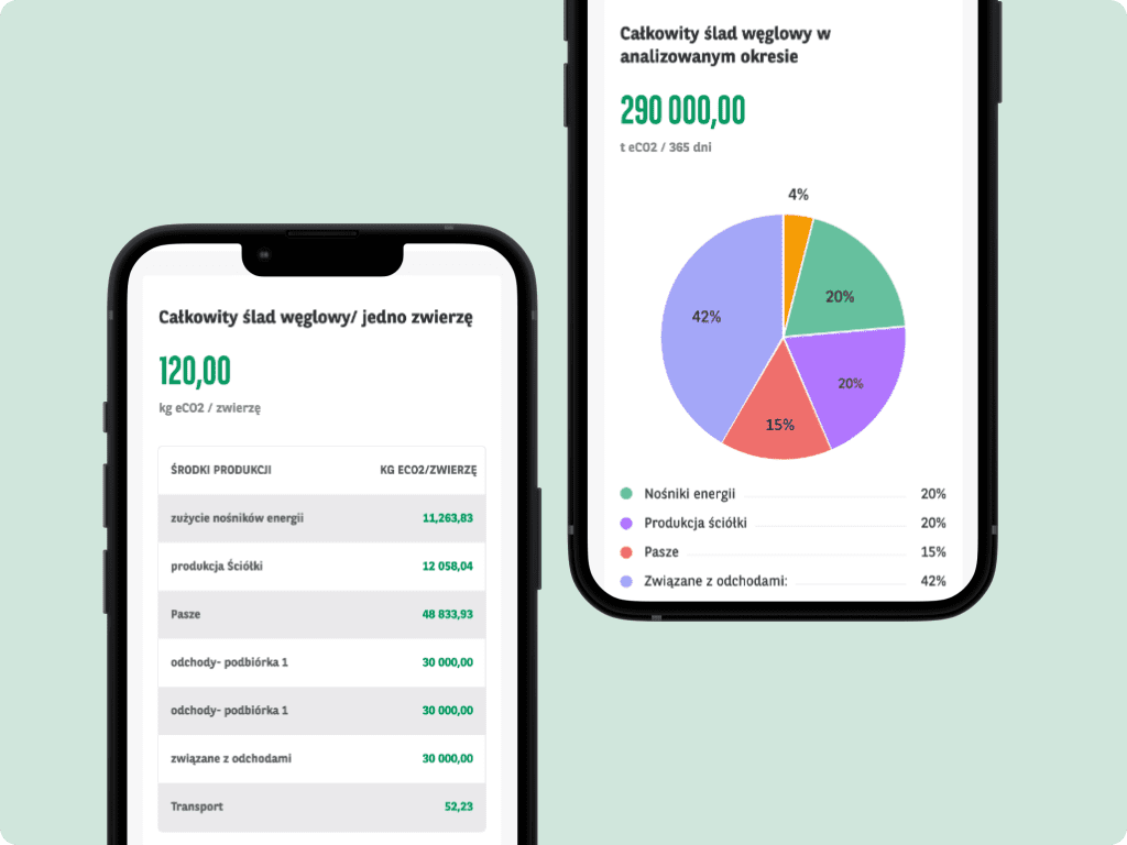
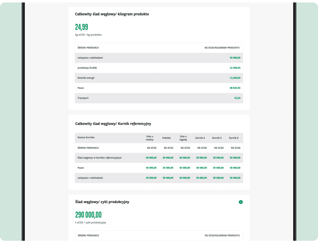
In-depth report
At the end of the calculation, users are presented with a comprehensive report; a breakdown of total emissions from key sources such as feed, transport, utilities, and litter.
Additionally in tables, allowing users to easily analyze and compare the data, the report presents emissions per individual animal, specific chicken or turkey coop, as well as specific groups of animals within the herd for pigs or cows.
These tables are a great insight into how the production plan directly influences emissions, revealing areas with potential for improvement.
Impact for business
Agronomist, armed with advanced analytical tools for farmers, establishes itself as an absolute powerhouse of knowledge and an invaluable educational resource for farmers.
By giving users access to these robust calculators, Agronomist leads the green transition and play a crucial role in supporting and educating farmers on their path towards more sustainable food manufacturing.
With these tools in hand, farmers have the power to make informed decisions, optimize their production, and embark on the path to more sustainable farming.
The growth of the platform heavily depends on the number of user registrations, and to encourage users to sign up, Agronomist creates a compelling incentive by offering access to selected tools exclusively to registered users…so if you are a farmer, go on! Register and unlock the platform’s full potential!
The solution
300.codes development team, as a part of KERRIS, worked on Agronomist portal implementation. I am happy to admit that 300.codes has fulfilled its obligations with due dillegence, fully implementing the terms of the contract. The work went quickly and with high quality standards. I can recommend 300.codes as a proven and reliable partner.


