SWISS KRONO: elevating User Experience for customers and resellers with One World hybrid app
Meet SWISS KRONO
SWISS KRONO Group – a leading supplier of wood-based materials.
The company has a rich history of over 50 years in the global market and its success lies in a deep commitment to delivering the highest quality wood-based materials for both interior and construction applications.
With its roots deeply embedded in Switzerland’s Luzerne, SWISS KRONO Group has established itself as a renowned name worldwide. Currently, SWISS KRONO Group employs over 5000 people and has a presence in more than 120 countries, showcasing its global reach and influence.
From selecting suitable wood to the finishing touches, SWISS KRONO Group takes care of all production steps for the majority of its products. This end-to-end control ensures consistent quality throughout the manufacturing process, and customers can rely on the brand name for guaranteed quality delivered worldwide.
The challenge
SWISS KRONO approached us with a request to audit their IOS app and design a native app for Android.
Following an extensive audit, we determined that developing an Android version would be just as time and money-consuming as building a brand-new app with redesigned user experience.
Our design and development team recommended SWISS KRONO to consider constructing a hybrid app for their solution. Hybrid apps are currently in high demand due to the numerous advantages they offer. They leverage a single code base that functions seamlessly across multiple platforms, resulting in cost-effective development and maintenance. They are particularly well-suited for applications that do not require the high computing power of the device, such as those for streaming (Spotify, YouTube, Netflix), and are more cost-effective as they bypass many of the extensive native requirements.
We successfully convinced SWISS KRONO to embrace the hybrid approach, and they enthusiastically jumped on board with the idea.
Scope & services
We offered a comprehensive range of services, starting with in deepth UX audit and assesment ending with creating an engaging animated onboarding.
During the design and development phases we delivered the following services:
- UX audit
- Scoping Sessions
- Competition analysis
- Product Design
- User Story Mapping
- Architecture of Information
- Lo-fi mockups
- Clickable prototype
- PIM integration (Akaneo)
- Development
The result
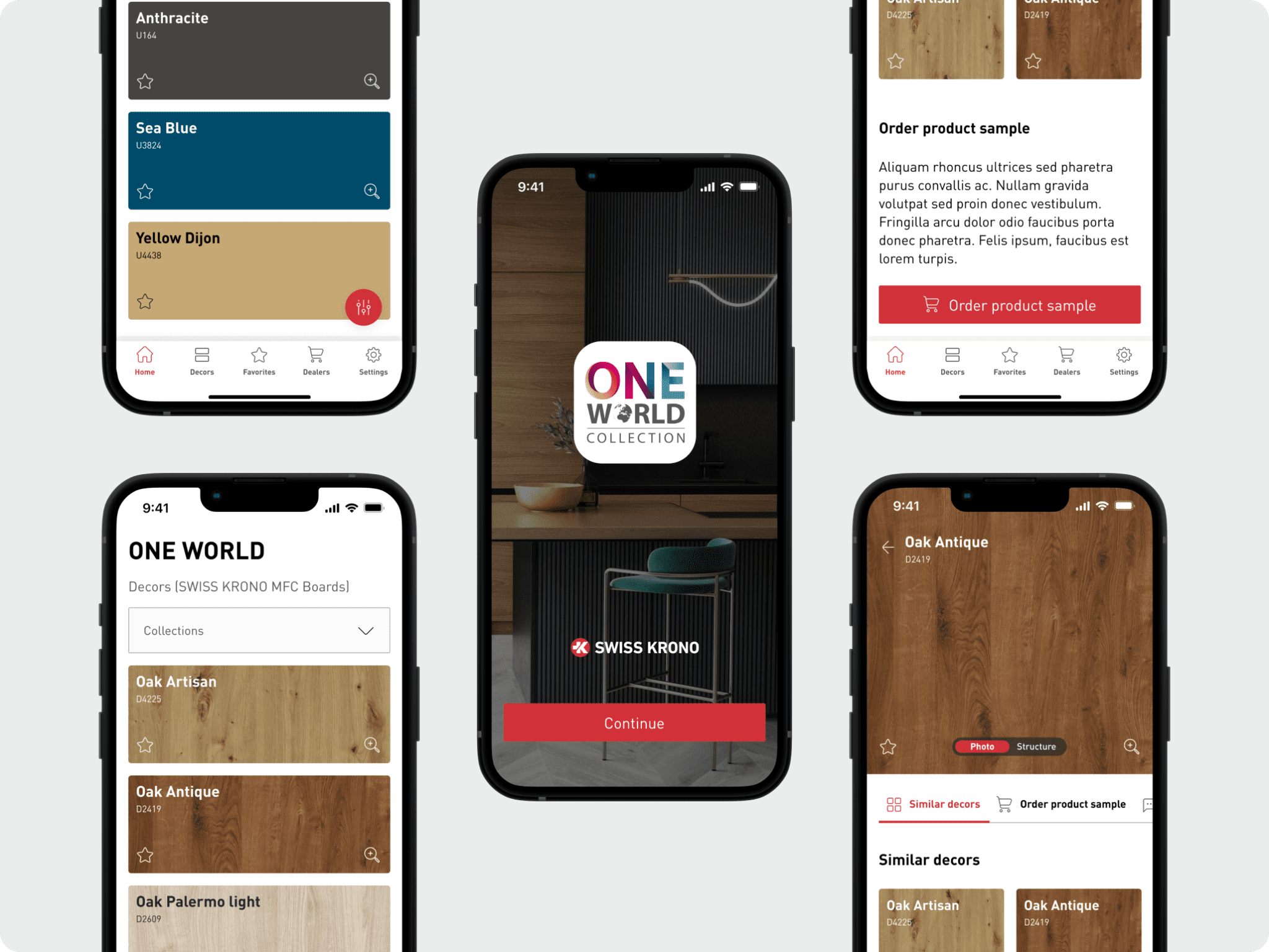
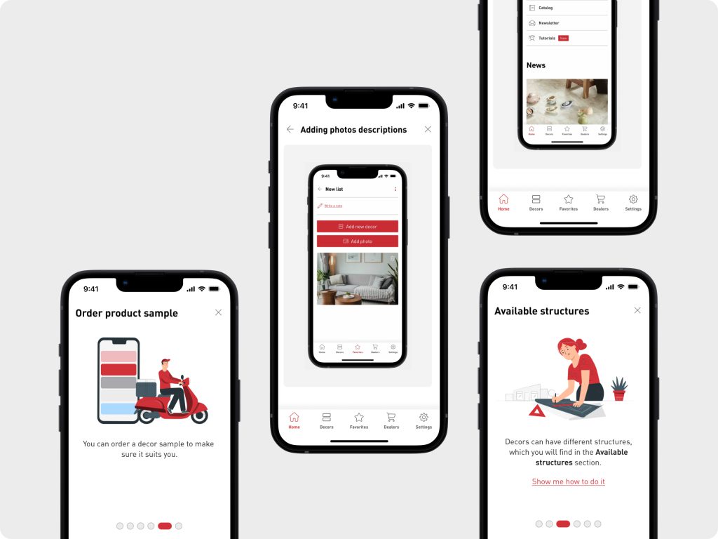
One World is an engaging app that provides clients, brand resellers, and in-house experts with access to SWISS KRONO’s wide range of products and collections.
The outcome is a hybrid app that offers a smooth and fluid user experience across platforms, allowing clients to explore and choose from the diverse selection of products with extra ease.
Additionally, we have integrated the One World app with Akeneo PIM (Product Information Management), a system that assists SWISS KRONO in organizing, centralizing, and managing all product-related information in a single location. Typically, managing product information manually is a laborious and time-consuming task. By integrating PIM, we can maintain consistency, reduce errors, and ensure the timely delivery of accurate information to customers. This integration aims to enhance user experience, streamline processes, and improve efficiency even further.
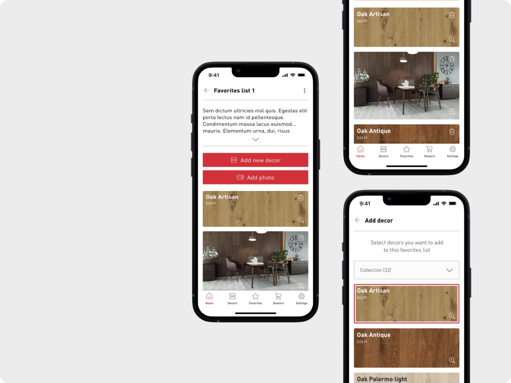
Clients can create personalized lists of their favorite floorboard samples and to embrace their creativity and engagement, we have included the option to enrich the list with additional pictures, such as images of their desired interior. This feature allows customers to visualize how the samples will complement their space, become inspired, and make informed decisions.
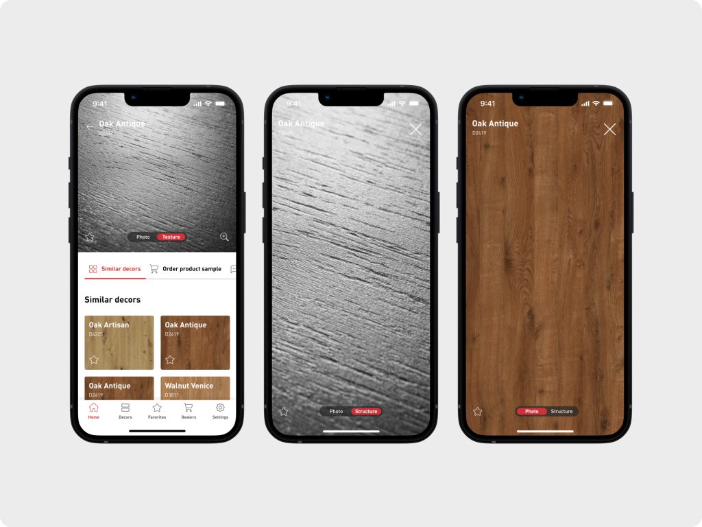
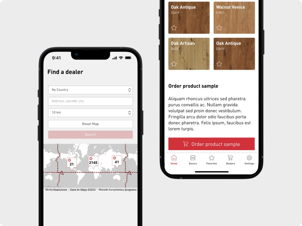
To ease browsing even further we’ve added the possibility to view the images and zoom into the texture of each sample, locate SWISS KRONO dealers, and conveniently order samples to ensure a perfect match for their flooring needs.
How we did this
By merging the client’s invaluable business insights with our expertise in product design, we successfully developed a solution that precisely catered to SWISS KRONO’s business needs.
SWISS KRONO’s remarkable understanding of their customers needs played a pivotal role during the scoping sessions. The synergy between their business insights and our technical proficiency enabled us to deliver a spot-on solution, placing the user at the core of the app’s design.
Discovery phase
The extensive audit revealed significant flaws in the existing app. The main issues included an unintuitive and confusing user experience (UX), ineffective navigation, inconsistent and user-unfriendly user interface (UI), unintuitive filtering, and non-standardized solutions. These flaws hindered the usability and productivity of the app.
It was crucial to address these weaknesses by redesigning the UX and UI, standardizing solutions, and improving overall user-friendliness to enhance the app’s effectiveness and user satisfaction.
During the workshop sessions, we identified the main beneficiaries of the app: SWISS KRONO’s in-house customer advisors and resellers and regular end receivers; customers of SWISS KRONO’s customers.
Key insights
- Reformatting and getting rid of technical debt
- The final solution should be a hybrid app with a seamless and fluid user experience
- Focus on redesigning filtering of products
- Create a cohesive visual and functional perception of a all calculators
- Keeping both user personas in mind (Customers and resellers and customer’s advisors ) and catering for both’s groups of users needs
- Creating engaging onboarning
Design, creation & development phase
We conducted several scoping sessions with the client. Throughout these sessions, together with SWISS KRONO we drafted a comprehensive set of functionalities for the app.
Through an iterative process, we clustered all these functional and non-functional requirements in order to form an understanding of the scope and nature of a digital product that we are going to deliver.
Our iterative workflow included the following frameworks and methodologies:
- Workshop sessions
- Scoping sessions
- Elements of Design Thinking
- Product Design
- Prototyping
- Development
UX design
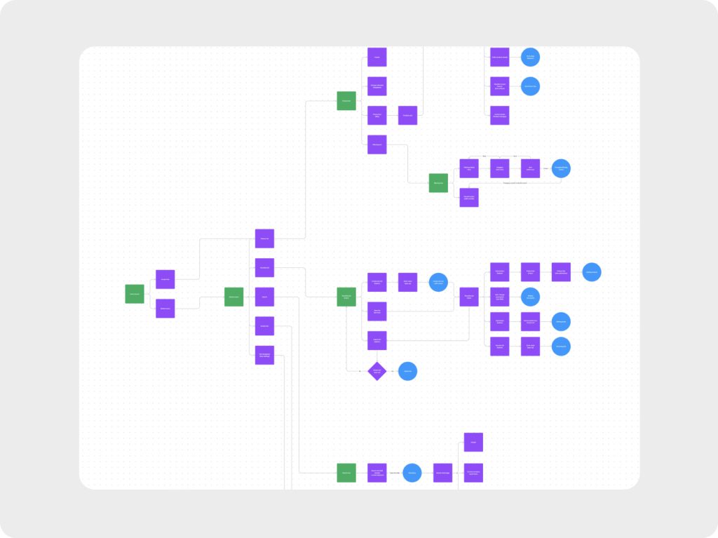
After gathering the client’s input and conducting extensive benchmarking and competitive analysis sessions, we proceeded to create the new architecture of information and flow for the new user experience.
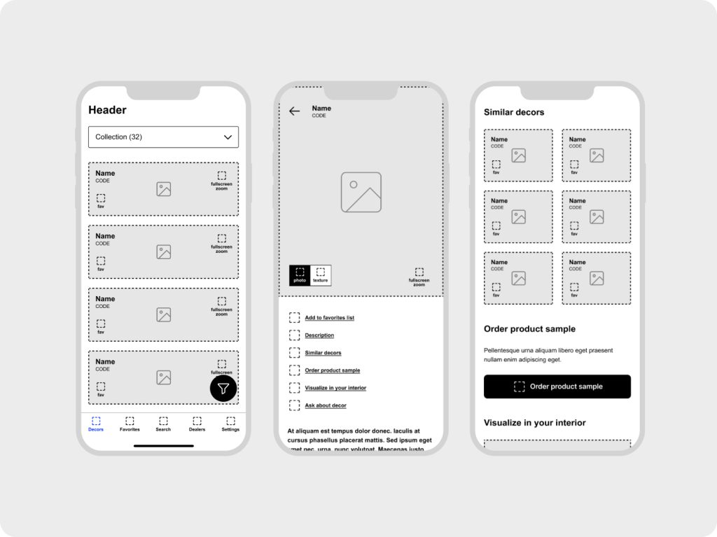
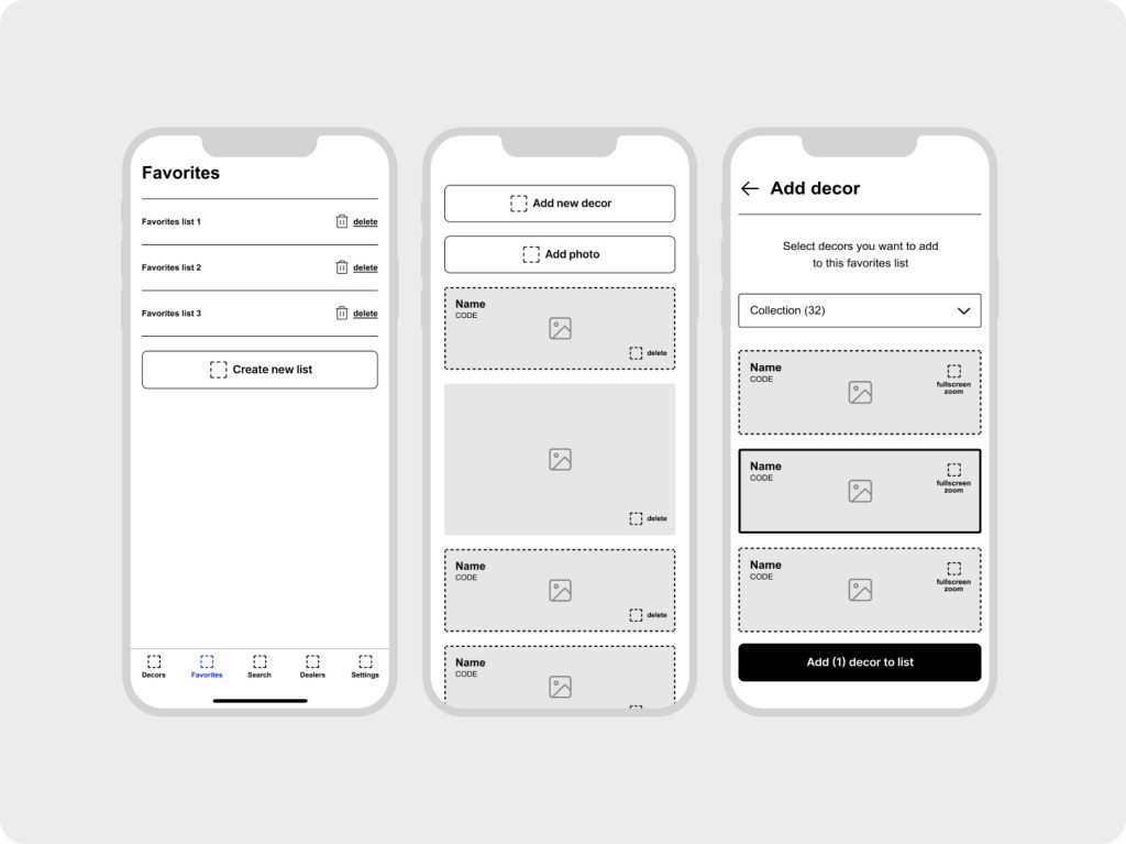
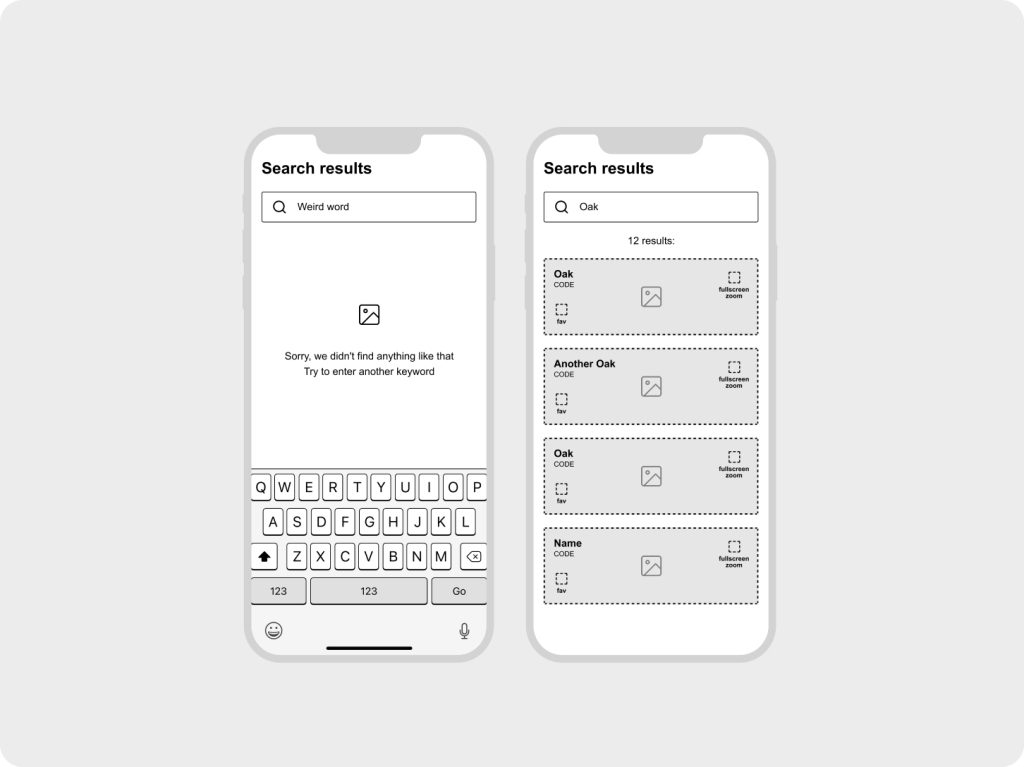
This stage was followed by preparing a set of lo-fi mockups and a clickable model of a future solution. Low-fi mockups are a great medium to effectively communicate and iterate our ideas with the client, gather feedback, and rapidly prototype to define and tackle potential weak points of the proposed solution.
UI design
We have crafted a seamless user experience for the app, complemented by a beautiful yet functional UI design.
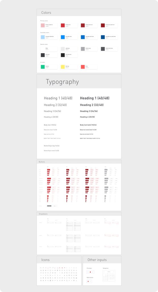
SWISS KRONO provided us with their brand book, as well as a comprehensive design system that we closely adhered to during the phase of creating high-fidelity mockups.
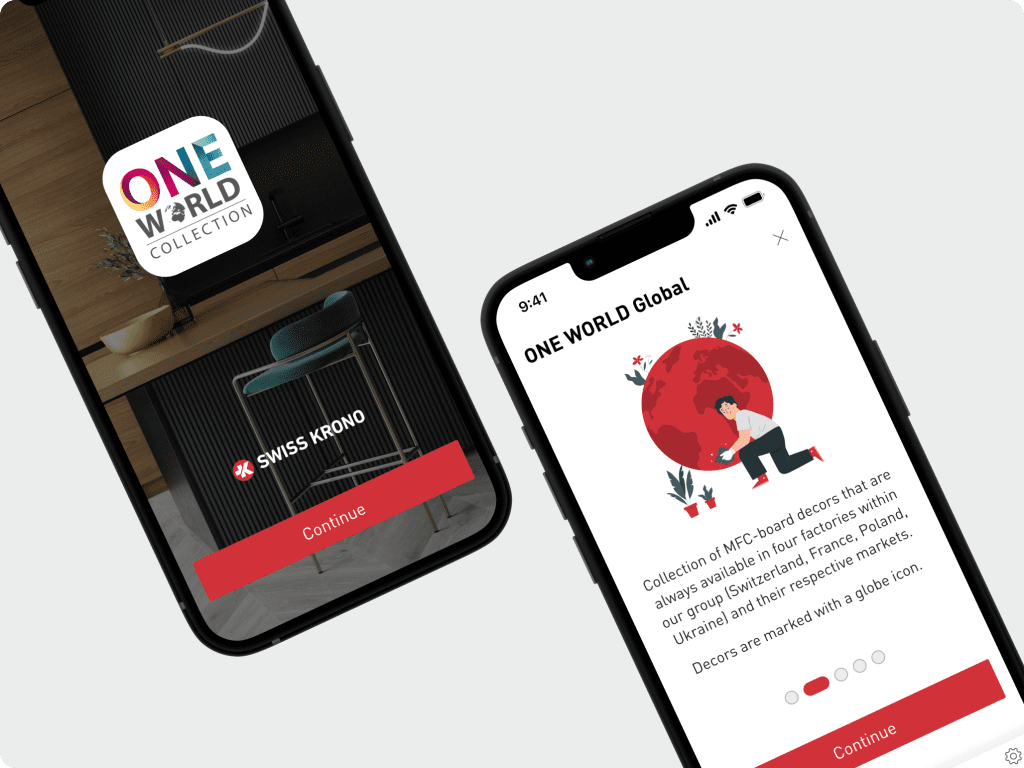
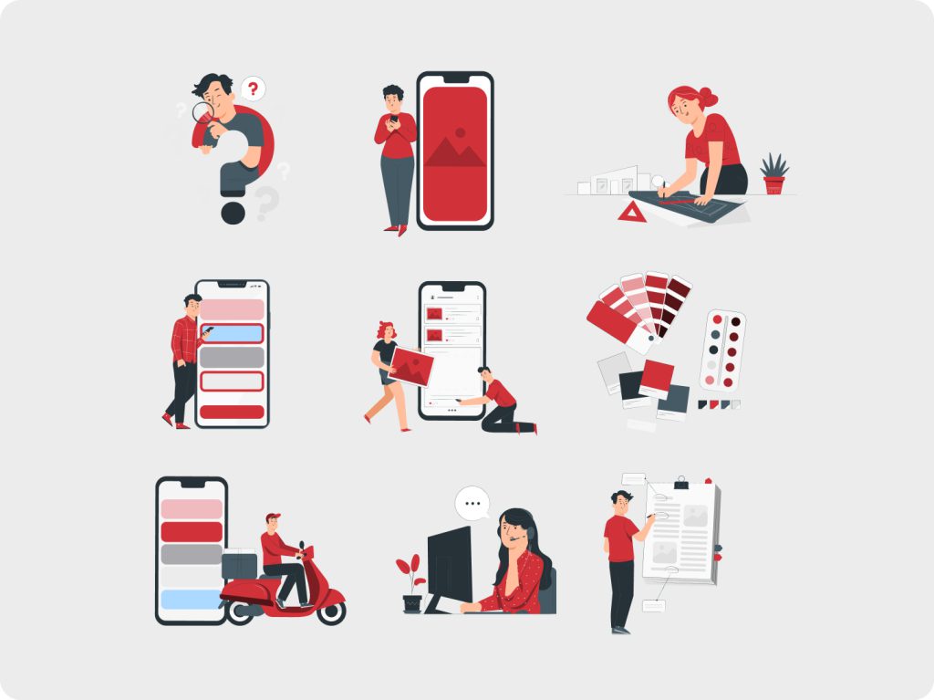
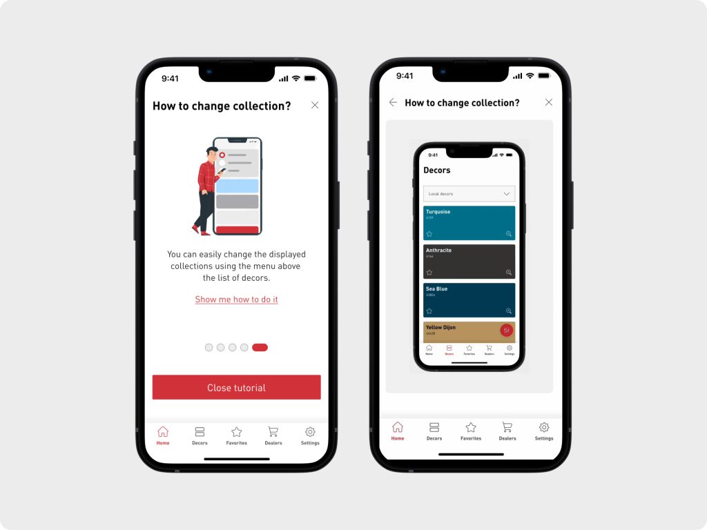
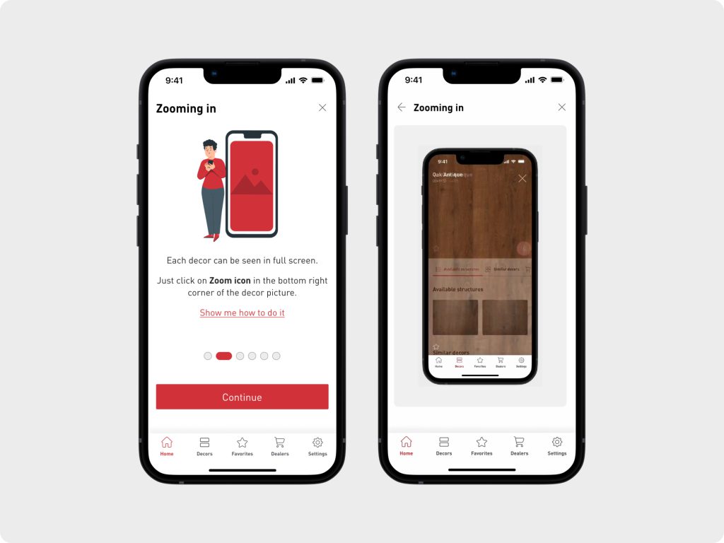
To complement SWISS KRONO’s sleek and minimal design system, our design team has provided a set of illustrations that enhance the animated onboarding experience.
These fun yet informative illustrations serve as an excellent medium to communicate complex ideas in a very approachable visual manner, helping users familiarize themselves with all the functionalities of the app.
Key elements of One World app
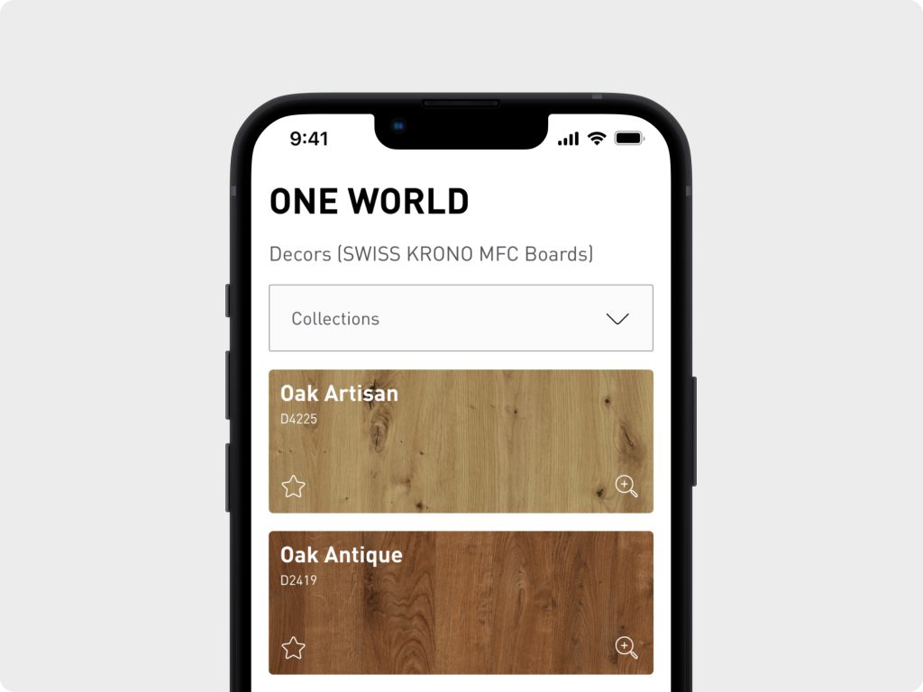
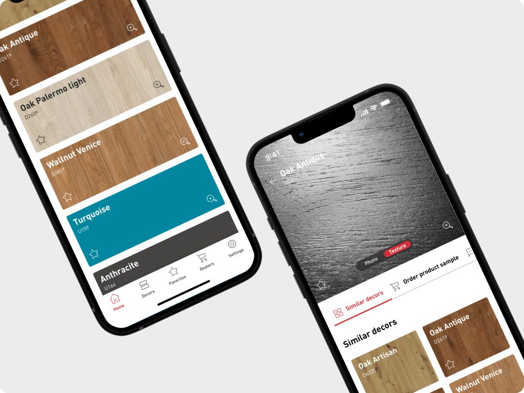
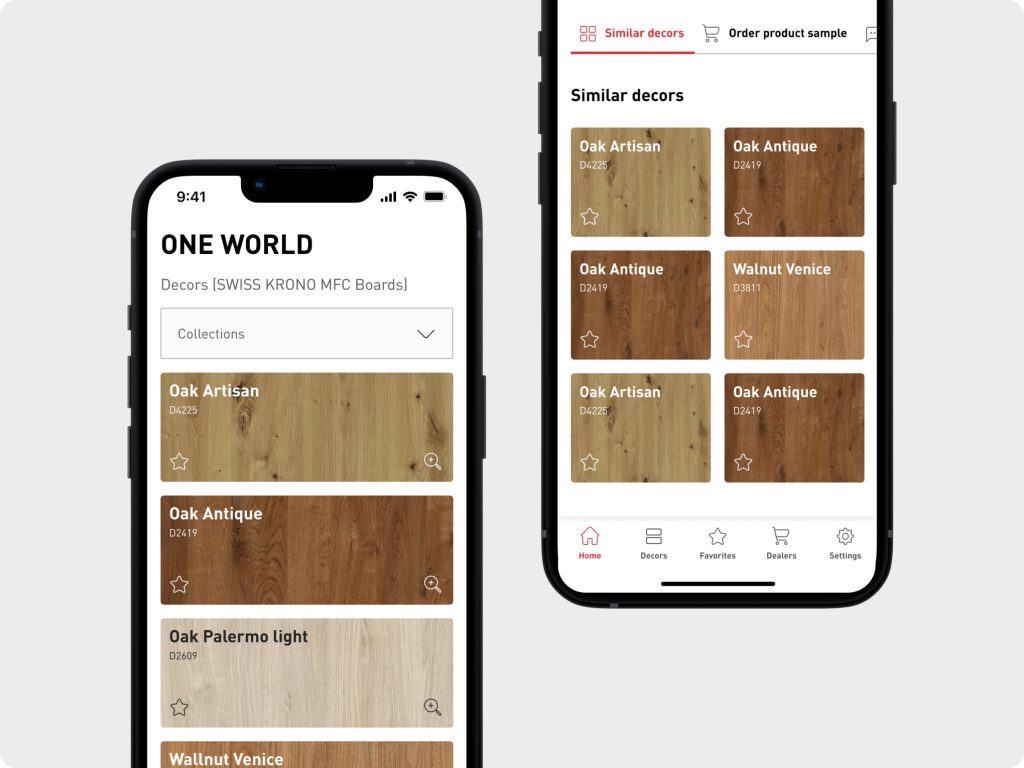
Browsing through SWISS KRONO’s vast catalog of products.
In our effort to provide users with a seamless browsing experience through SWISS KRONO’s vast library of products, we opted for a comprehensive redesign of the app.
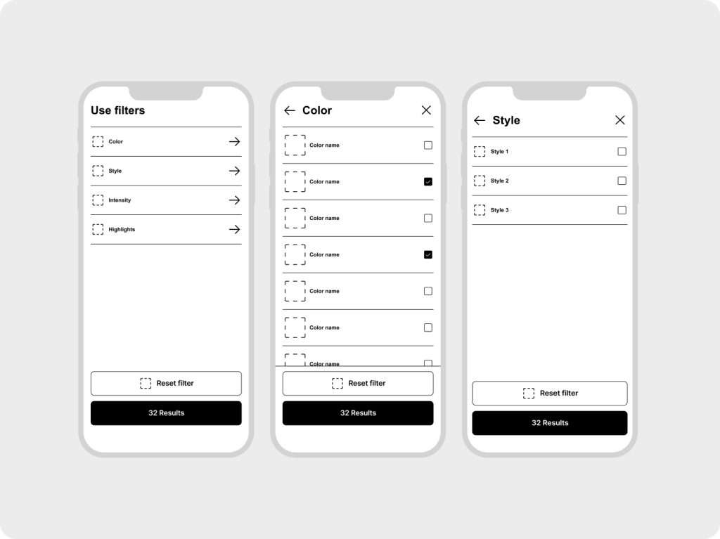
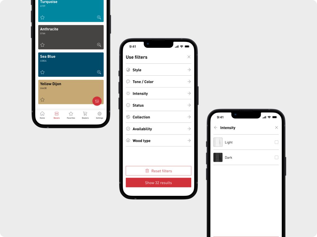
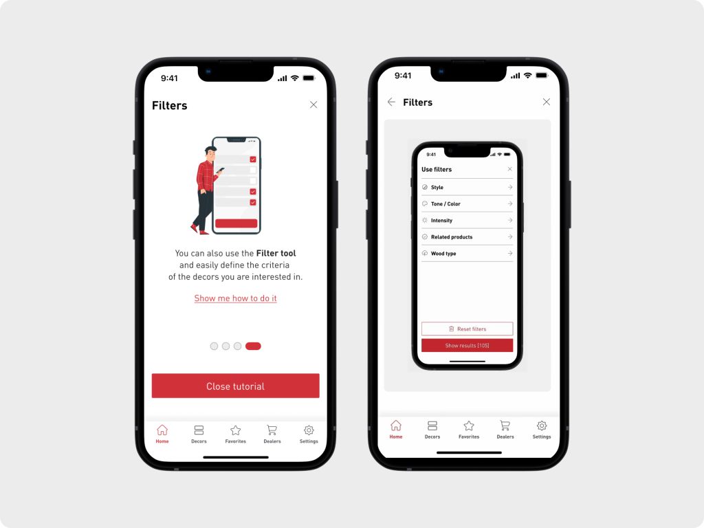
Our primary focus was to rethink the filtering through the samples, which significantly enhanced the browsing experience. Users now have the option to choose from a diverse collection of products or utilize advanced filtering options such as style, color, intensity of texture, availability, and wood type. This allows them to quickly narrow down their search and find the perfect sample.
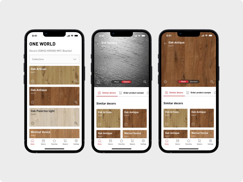
To enhance the look and feel of a native app and support seamless interaction with the app we introduced a bottom navigation bar. This extra intuitive feature allows users to easily access various sections of the app, including navigating to the catalog of samples, managing lists of favorite products, finding dealer addresses, and accessing settings.
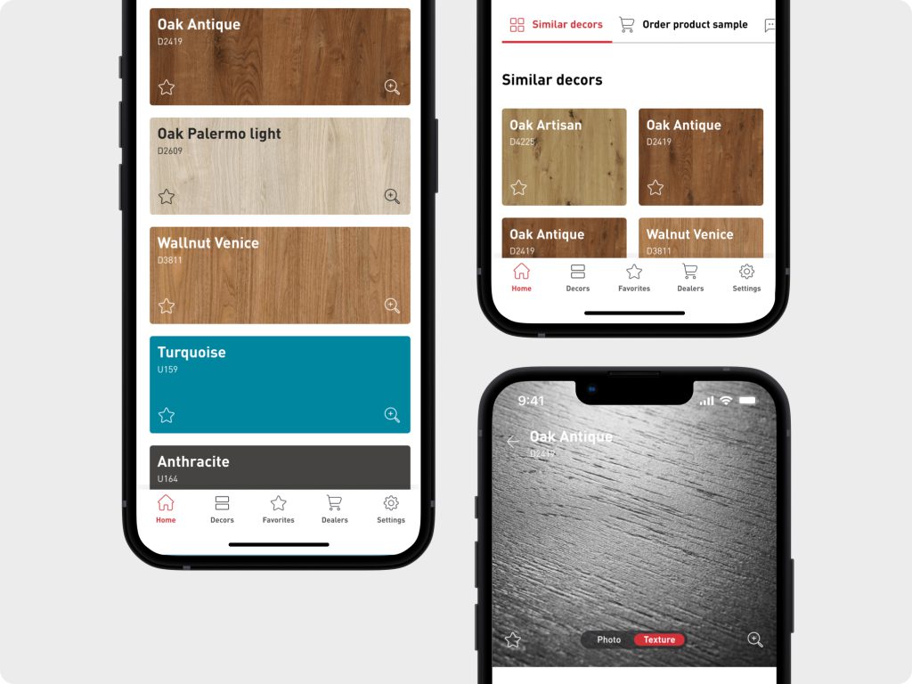
Overall, the redesigned app offers users a highly intuitive and streamlined experience while browsing SWISS KRONO’s extensive catalog of products. With enhanced filtering, zoom capabilities, and improved navigation, we have created an app that gives users the power to explore and select samples more efficiently.
Detailed sample page
To further assist users, on a detailed sample overview, we have incorporated an option to zoom in on the images, enabling them to examine the sample’s structure and details more closely. These small tweaks give users greater confidence to explore the products and make informed decisions about selecting a particular product.
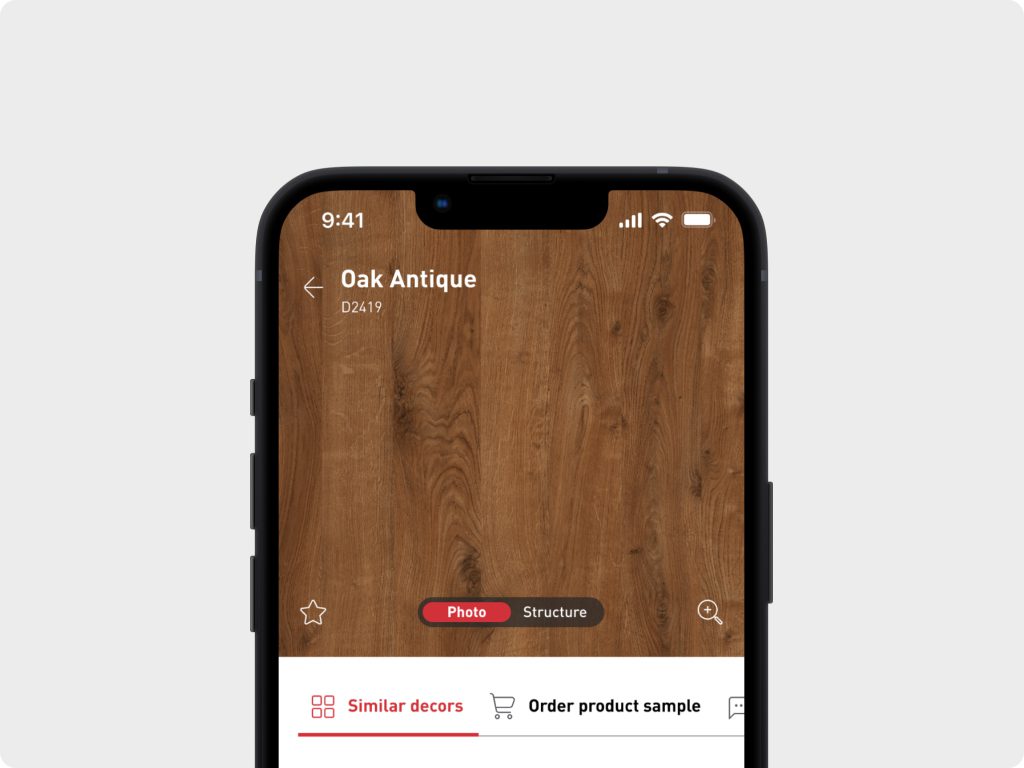
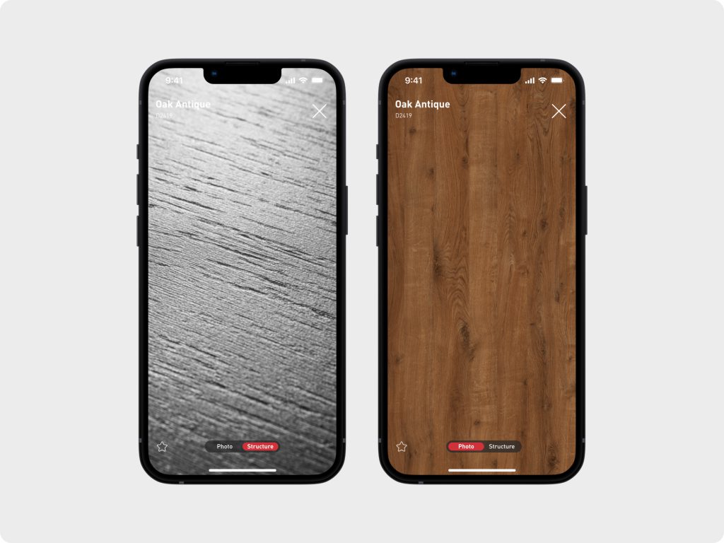
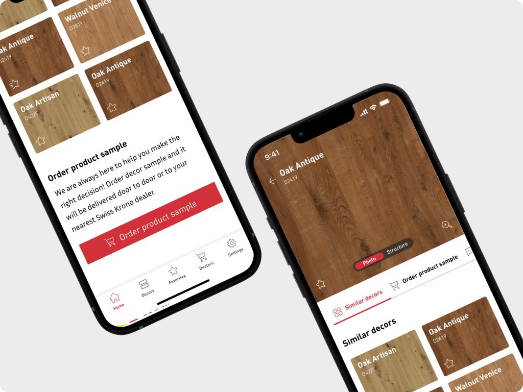
Additionally, we’ve explored the potential of cross-sale, showing users a list of all samples that are affiliated with the decor they are inspecting. Another handy feature of the app is the possibility to order decor samples to bring the experience closer to standard eCommerce and even further empower users to make informed decisions.
Creating lists of favorite samples
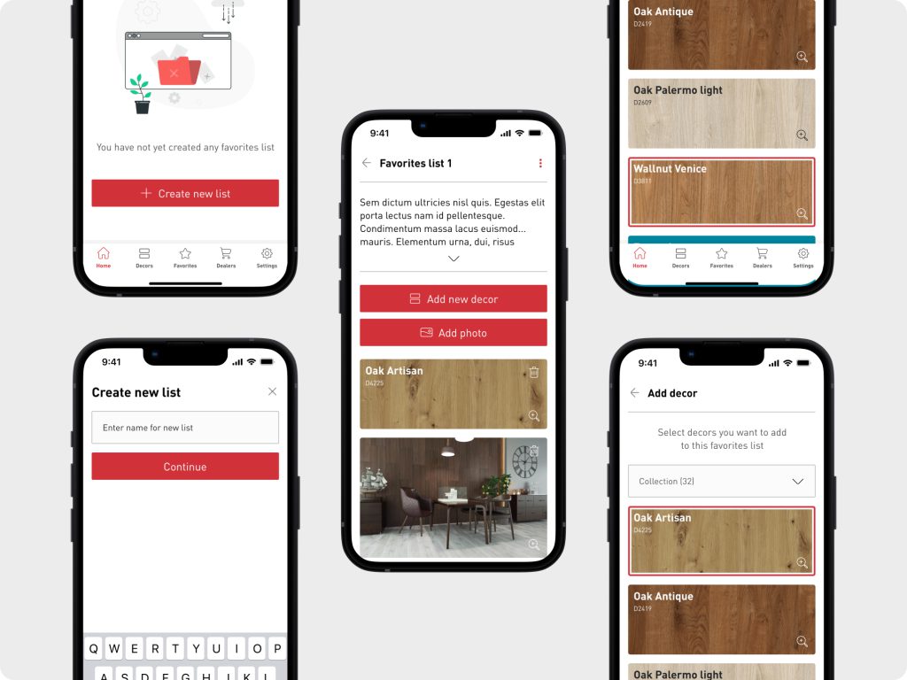
To ensure a truly personalized experience we introduced a list of favorite samples, users can now curate multiple Pinterest-like lists of their favorite floorboard decors.
To spice things up we added the possibility to upload photos straight from the phones. This fancy little add-on allows them to add pictures of desired interiors, designs, or any other inspirational images to enrich their lists and make them truly personal.
This exciting enhancement not only builds engagement among the users but also influences the personalization of the app, tailoring it to their individual tastes and preferences.
As users invest their time in creating and organizing these collections, they develop a sense of ownership and attachment and the likelihood of continued usage grows proportionally.
Animated onboarding
To assist first-time users in getting acquainted with the app’s powerful UX, we have incorporated a super handy animated onboarding feature. This usefull add-on will guide users through the app’s features and ensure they have a smooth and engaging introduction to the app’s capabilities.
Impact for business
One World was recently released, so we cannot share any data at the moment. That said, we have signals that the launch has had a notable impact on SWISS KRONO’s business by fostering substantial cost optimization through the implementation of advanced hybrid technology. This achievement represents a significant leap forward for SWISS KRONO.
We have taken a significant step towards streamlining the overall experience and propelling our business forward by integrating a Product Information Management (PIM) Akaneo system into the app.
PIM integration allows effective management and distribution of product information, resulting in time savings, error reduction, and delivery of accurate and consistent product details to customers across various sales channels. This enhancement elevates the efficiency of SWISS KRONO’s operations and takes the user experience to new heights.
They have very professional design service standards, as well as a team of high-class specialists who deserve trust. Working with 300.codes you know that you are in good hands and your project will be delivered to the highest standards. I couldn’t expect more.


